Search My Blog

Monday, June 21, 2010

MSR CAMPING PRODUCT AD CAMPAIGN

Preparing for a long outdoor journey is no joke! Whether you are about to climb the highest peaks or getting ready to be awed by the breath-taking Grand Canyon at dawn, you will need a lot of water. And when you’re not quite sure what you’ll find, you need the tools that you can rely on. So grab all the essentials you may need to enjoy the wildlife while going light on those buckets and buckets of water. Because if you are one true climber, hiker or other back-country enthusiast, you definitely only need one and the most comprehensive Water Treatment & Hydration solution, that is as enthusiastic as you are at keeping you hydrated anywhere on earth.

Instead of targeting active people at large, the campaign targets only those who are serious recreation lovers, outdoor addicts or wildlife photographers, who need a lightweight, heavy use, versatile treatment for all demanding water conditions. They take regular and extensive expedition journeys, and are eco-conscious. They do their packing accordingly to maximize safety, efficiency, and mobility and minimize inconvenience. Thus, the campaign offers 2-page spreads of breath-taking landscape references in magazines such as Outdoor Photographer, Urban Climber, Backpacker, National Geographic Adventure, Rapid, Outside, Climbing, or Camping Life for those who appreciate marvelous scenery.
 

Sunday, June 20, 2010

CONTINENTAL AIRLINE AD CAMPAIGN

Sometimes when the "product" is actually a service, it takes more than just a good package to make the sales. That's when quality, reputation, and reliable promise all take role; and thus, a copy-oriented direction that plays on a light humorous, yet sincere voice can promise an effective solution. The challenge is to get the audience to catch on the double reads - first, the immediate meaning of the obvious texts, and then the between-the-line extended context of the second reading. However, the campaign isn't designed to target everyone, and some of the unintended audience may pass on on the ads. Yet, the campaign targets those who predictably are readers of Time, Newsweek, and/or other likewise magazine categories, those who value business and are potentially become loyal customers. To those, they likely will get the double reading and recall it in future reference. (Click on the ads for enlarged versions)

 
"Dont remember us (for any negative experience) - Then we are successful indeed (at doing our job)" [Body copy] No flight in particular should stand out in your flying sequence because you should expect our service to be the same every flight, every time. Enough said, we strive our best to keep your experience with us as great, positive, and consistent from your first time on. Keep up your hard work and let us take care of you while flying. Continental is proud to serve you. 

  
"You can be late (at the gate) - But we can't (on our date) [Body copy] Let’s face it! Being late on a date never looks good, not to mention being late on a job. So while we try to keep your flying experience with us as light, fun, and care-free as possible, we are serious about being professional and on time. So pick a “date”, or two, and we will do the setting up. Take all the time you need because we always want you to feel good on any date. See you at the gate!

"We don't sell airfare (yes, we know gas price is very concerning) - Unless we sell "reputation" (that's still something priceless) [Body copy] The truth is, tickets can be on sale, but nobody can put a price tag on reputation. Thus, no matter how much you’ve paid for your fare, your feedback matters the same to us. So unless we plan on kicking the bucket anytime soon, we listen to your every concern equally. Therefore, save away the bucks while we “trade in” our great service, since your feedbacks are the things we cannot buy.

Saturday, June 19, 2010

SELF-PROMOTION

Handmade "Packaging and everything else" calendar to promote my package design portfolio.

Saturday, June 12, 2010

RANDOM COLOGNE BOTTLE SKETCHES

Just some random sketches I did for a cologne design back then.

Friday, June 4, 2010

ANIMAL PLANET AD SERIES

In February, 2008, Animal Planet "relaunched" itself under a new image that "sheds its soft and furry side for programming and an image with more bite." As part of the relaunch, Animal Planet replaced their elephant and spinning globe logo for a starker text image that allows more flexibility in its usage.The goal is to move from being perceived by viewers as paternalistic, preachy, and observation-based to being seen as active, entertaining and edgy. That means targeting adults 25-49, rather than full families, with less voice-of-God narration and more visceral imagery and sounds. Therefore, this campaign expands to viewer ranges to a new unusual group of adults and can be launched in home furnishings/interior publications to target those who love to incorporate nature and wildlife elements in their home decors.
   

Thursday, June 3, 2010

NRG HAND GARDENING TOOLS - AD SERIES


Natural Radius Gardening Tools (NRG) grew out of sore wrists and frustrating experiences that traditional gardening tools may cause. The new innovative of a curved handle sets your wrist and hand in a natural to maximize your power and comfort while minimizing the injuries. It's like having power tools without the power switch. It's the right way to "handle" the gardening!


Thursday, May 6, 2010

BRAND/IDENTITY

Some of the logos I have worked on in the past.

REBRANDING MIROLO CHARITABLE FOUNDATION

LOGO EXPLORATION //
Mirolo is a philanthropic organization in Columbus, OH. Through the CCAD design department, they wanted to conduct a logo redesign to improve its current logo's readability and to better represent the "helping hands" aspect of the organization. In addition, in my design considerations, I also "borrowed" some of the personality qualities and visions of the organization's founder who was very reserved, dignified, conservative, and an absolute fine art lover. Three of my designs were chosen to be in the final four where I developed a full stationary set for each logo for demonstration.
SOME OTHER LOGO SKETCHES // 

Thursday, February 25, 2010

ALLURE NAIL SALON & SPA

With limited budget, the challenge was on! After its humble opening, the spa needed a visual update to better match its appearance and the quality. As the shop locates at a resort area of Hilton Head Island, South Carolina, I decided to transform its rather modest retail space into a more unique, beachy, and cozy atmosphere, unlike any other shops on the island. With limited resources for decors and furniture, I found whatever I could, and then just improvised with lots of manual tweaking, time, and of patience. In the end, after endless hunts, countless return-trips, spraying, painting, remodeling, furniture recycling, below is a little glimpse at some that I have done with the time and budget allowed.

Saturday, February 20, 2010

PUBLIC SERVICE - TEEN PREGNANCY

Magazine full-page foldout ad. Campaign placement: Seventeen magazine/ High school yearbooks.
[Body copy] Sacrifice is part of being parents, but yours aren’t always there telling you how much sacrifice one has to make. Remind yourself. Use protection. Have a nice Prom!

Wednesday, February 17, 2010

BEAUTY SET PACKAGE DESIGN

Done for the package design class. Click here for more pictures.
 

Tuesday, February 16, 2010

ARCHITECTURAL DIGEST MAGAZINE MAKEOVER


Click here for the publication's current look.

Monday, February 15, 2010

Sunday, February 14, 2010

LOGO CONCEPTUAL SKETCHES

As a graphic designer, I find myself drawn a great focus/interest around Logo/Brand Identity although I enjoy doing Packaging, Conceptual sketching, Publication and web layouts, and other things as well. Here are some samples of the logo making/brand-repositioning work I have done in the past.

Wednesday, December 23, 2009

INTERACTIVE WEBS

WEEGO BABYLIFE PRODUCTS


THE WEBSITE OF IVANLO PHOTOGRAPHER


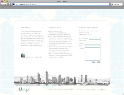
BLOOP - TRAVELING PLANNER APP